Most workflow reports fail for 3 plain reasons: bad handoffs, loose KPI definitions, and no owner for the dashboard. If I run a portfolio company, that means I can have a clean-looking report and still miss the early signs of margin pressure, slower cash collection, backlog risk, or a slipping value-creation plan.
Here’s the short version:
- Manual exports break control - CSV pulls, spreadsheet edits, and slide updates add error risk and leave weak audit trails.
- Mixed metric definitions break trust - if sales, finance, and ops define the same KPI in different ways, meetings turn into number debates.
- Late source updates break timing - a dashboard can refresh every 5 minutes and still be wrong if the CRM or ERP is not updated on time.
- Too many dashboards break action - if no one owns the report, the threshold, or the next step, the dashboard becomes noise.
- The fix is simple in concept - control the data path, lock the KPI definition, and assign 1 owner per dashboard.
For private equity operators and portfolio CEOs, the test is direct: does the report help me act before the issue hits revenue, EBITDA, or cash? If not, it is not a decision tool.
I’d boil the article down to this checklist:
- Map each KPI to its system of record
- Remove weak manual handoffs
- Set 1 approved KPI definition
- Show the data-as-of date and refresh timing
- Match report cadence to the decision
- Cut duplicate dashboards
- Put thresholds, owners, and due dates on exceptions
A useful workflow report does not need more charts. It needs control, accountability, and clear links to business outcomes.
What causes workflow reporting to break
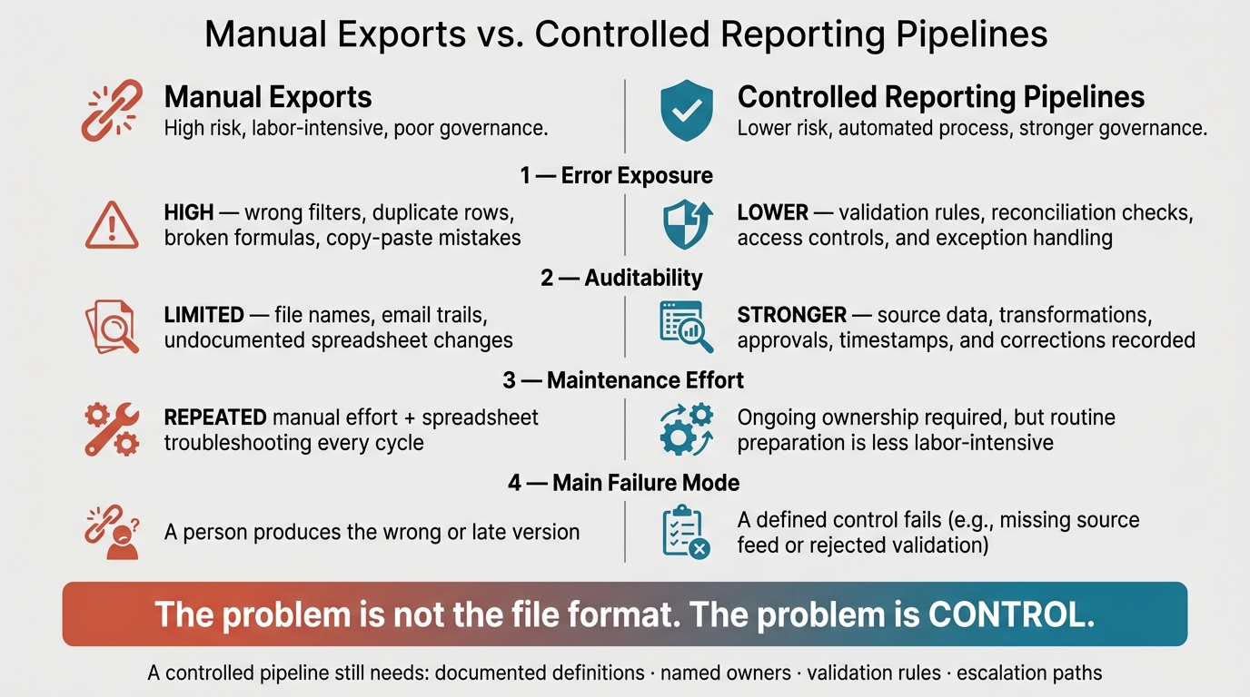
Manual Exports vs. Controlled Reporting Pipelines: Key Differences
Workflow reporting usually breaks at 3 control points: data movement, metric design, and dashboard governance.
In most portfolio companies, reporting does not fail because of one bad tool or one bad analyst. It fails because the workflow has too many unchecked steps, the KPIs are not defined the same way across teams, and no one owns which dashboard is the source of truth.
Manual exports create error-prone reporting handoffs
Manual reporting chains create avoidable control risk.
A common sequence looks like this: export CSVs from source systems, clean them in spreadsheets, adjust formulas, copy charts into slides, and email the report. Every handoff adds an uncontrolled step. There is no validation, no audit trail, and no direct way to confirm that the number in the email matches the number in the source system. That is how a bad date range or an old file can distort an operating review before anyone catches it. Separate spreadsheet versions can also lead to conflicting final numbers, with no clear sign that either one is wrong.[3][5]
| Dimension | Manual exports | Controlled reporting pipelines |
|---|---|---|
| Error exposure | High; vulnerable to wrong filters, duplicate rows, broken formulas, and copy-paste mistakes | Lower when validation, reconciliation, access controls, and exception handling are enforced |
| Auditability | Often limited to file names, email trails, and undocumented spreadsheet changes | Stronger when the process records source data, transformations, approvals, timestamps, and corrections |
| Maintenance effort | Repeated manual effort plus spreadsheet troubleshooting | Ongoing ownership is still required, but routine preparation is less labor-intensive |
| Main failure mode | A person produces the wrong or late version | A defined control fails, such as a missing source feed or rejected validation |
The problem is not the file format. The problem is control. A controlled pipeline still needs documented definitions, named owners, validation rules, and escalation paths.[4][7]
Weak metric definitions and low system adoption distort the numbers
If teams define KPIs differently, the dashboard becomes a debate tool instead of a management tool.
Even when the export process works, the numbers can still be off because teams calculate the same KPI in different ways. Pipeline coverage, churn, and backlog often use different scopes across functions, so the same label produces different numbers.[2][6][7]
Low system adoption makes the issue worse. If sales reps update opportunities only when a deal is close, or service teams log completion after the fact, the CRM or ERP becomes a partial record. Missing fields, inconsistent stage values, and weak timestamps flow straight into the report. The dashboard may be accurate to the system record, but not to the business itself.
| Symptom | Likely root cause | Reporting risk |
|---|---|---|
| Stale CRM or ERP records | No update standard, unclear ownership, or users working in side spreadsheets | Pipeline, backlog, and forecast reports understate or misstate current activity |
| Duplicate customers or opportunities | Inconsistent record-creation rules or multiple manual imports | Revenue, churn, workload, and conversion rates may be double-counted |
| Mismatched KPI values | Different formulas, scopes, or time periods across teams | Leaders debate the number instead of deciding what to do |
| Missing stages or timestamps | Required fields not enforced or users skipping workflow steps | Cycle time, conversion, aging, and forecast metrics become unreliable |
| Spreadsheet totals differ from system totals | Manual adjustments are undocumented or extracts use different filters | Reconciliation consumes time and undermines confidence in the report |
Even a correct formula fails if the source data is incomplete or stale.
Stale data and dashboard sprawl hide the operating signal
Fast refresh does not fix stale source data.
Stale data is the lag between business activity and the report. If a customer cancels on Tuesday but the CRM is not updated until Friday, a dashboard that refreshes every 5 minutes still shows stale data. The fix is not more refresh frequency. The fix is making sure the source record is updated on time, in a consistent way, by the right person.[4]
Dashboard sprawl creates a second problem. Teams tend to add dashboards faster than they retire them, and the result is a pile of overlapping views with conflicting definitions and no clear owner. When 2 dashboards show different values for the same KPI, the meeting shifts from action to argument. In an operating review, that is a bad use of time.[8]
| Reporting cadence | Acceptable data age | Typical use case | Main limitation |
|---|---|---|---|
| Real-time or near real-time | Minutes to a few hours | Active service queues, production incidents, cash or order exceptions requiring immediate intervention | Fast updates can surface incomplete or unvalidated data |
| Daily | Less than 24 hours | Sales activity, collections, open tickets, and near-term delivery risks | May lack enough context for financial or strategic interpretation |
| Weekly | Approximately 1–7 days, with a defined cutoff | Pipeline reviews, backlog movement, project execution, forecast changes, and operating meetings | Late updates or inconsistent week-ending rules can make trends incomparable |
| Monthly | Usually finalized through the month-end close | Revenue, gross margin, EBITDA, cash conversion, and board reporting | Data is more controlled but may arrive too late for fast-changing operating issues |
The right cadence should match the decision, not default to the fastest refresh possible. Each cadence also needs a clear cutoff, a validation process, an owner, and an escalation rule for late data.[2][4][7]
These failures point to 3 controls: controlled data flows, a metric dictionary, and dashboard ownership.
How portfolio companies fix unreliable workflow reporting
Fix 3 things: the data path, the metric definition, and dashboard ownership. Each one removes a different break in the reporting chain. You do not need every portfolio company on the same software stack to do this well.
Replace fragile reporting steps with controlled data flows
Map every KPI back to its system of record first. For each metric used in an operating review, document the system of record, source fields, approved calculation logic, and the person accountable for the data. Then trace every manual handoff between that source and the final report - exports, spreadsheet transfers, email attachments, and copy-paste. That is where control usually fails.
Replace those handoffs in stages. Direct integrations or scheduled system queries are the cleanest route. If that is not practical, use a validated upload template with locked formulas, required fields, and a named submission owner. That is a clear step up from ad hoc exports. In one portfolio-monitoring case, linking ERP, CRM, and financial sources directly to the reporting platform removed recurring manual pulls entirely. Each company can run different systems, but each reporting layer still needs documented source-to-report mappings. [1]
Before data reaches a dashboard, run automated checks. Flag missing required values, duplicate records, invalid date ranges, broken joins, and outliers. Outlier checks should trigger review, not automatic overwrite. A 40% month-over-month drop in bookings may be real, or it may come from a filter error, and those are 2 very different situations. [9][10] Every published report should show the last refresh time, the system of record, the calculation logic, and the data owner. That metadata helps the reader tell the difference between a current operating signal and an unresolved data issue.
Once the data path is under control, lock the metric definition before it gets to any dashboard.
Build a metric dictionary and enforce workflow controls
If teams calculate pipeline coverage in different ways, the dashboard turns into an argument. A metric dictionary fixes that by giving each KPI 1 approved definition before it reaches any report.
Each entry should include the formula, business purpose, inclusion and exclusion rules, source fields, reporting period, owner, and refresh timing. For example, a gross retention entry should spell out the opening recurring-revenue base, exclude new logos and acquired accounts, define FX treatment, name the billing system, assign the owner, and set the monthly refresh date.
| KPI | Approved definition | Source system | Owner | Refresh cadence | Validation rule |
|---|---|---|---|---|---|
| Monthly recurring revenue | Recurring subscription revenue active at month-end; excludes one-time fees and canceled contracts | Billing or ERP system | Controller | Monthly, by the fifth business day | Reconcile to the approved billing total; flag changes greater than 10% month over month |
| Gross retention | Beginning-period recurring revenue less churn and contraction, divided by beginning-period recurring revenue; excludes new business | Billing and CRM systems | CFO | Monthly | Beginning balance must equal the prior month's ending balance |
| Pipeline coverage | Qualified pipeline expected to close within the approved period divided by the period's bookings target | CRM | Chief Revenue Officer | Weekly | Require stage, close date, amount, and opportunity owner; flag close dates outside the reporting period |
| On-time implementation rate | Implementations completed by the committed date divided by implementations due during the period | Project-management system | Chief Operating Officer | Weekly | Require committed date and actual completion date; exclude projects formally re-baselined before the due date |
| Record completeness | Required fields populated across in-scope records | Workflow or CRM system | Process owner | Daily or weekly | Alert below 98% for critical fields |
The dictionary also helps separate lagging results from leading indicators. Lagging measures - revenue, gross margin, churn, completed implementations - tell you what already happened. Leading indicators - share of opportunities with a next step, invoice approval cycle time, overdue implementation tasks - tell you whether the process is likely to produce the right result next month. Put both in the same review so the team can act instead of just looking backward.
Enforcement needs to happen at the point of entry. Required fields, controlled picklists, date-range validation, and role-based permissions make the system of record the default path instead of an extra task. Track adoption through completeness rates, on-time update rates, and the share of records created outside the approved workflow. Keep controls proportionate. Require only the fields that drive a decision or feed a downstream process, and review them with frontline users so you do not push people into workarounds.
After the metric is defined, each dashboard should serve 1 decision and 1 owner.
Govern dashboards by decision, owner, and action threshold
A dashboard with no owner and no decision attached is noise. Start by cutting dashboards down to the ones that drive action. Inventory each one by audience, purpose, source, owner, cadence, and last decision use. Retire or combine anything with no active owner, duplicate content, or no documented decision use.
Then set a simple hierarchy. A portfolio overview gives sponsors and operating partners company-level trends and exceptions. A company operating review gives the executive team cross-functional performance with named owners. Functional workflow views give sales, operations, and finance leaders the record-level detail they need to intervene. Exception reports surface items that crossed a threshold and need resolution.
| View type | Audience | Purpose | Refresh cadence | Allowed detail |
|---|---|---|---|---|
| Portfolio overview | Sponsor, board, operating partner, CEO | Compare performance, value-creation progress, liquidity, and major risks across companies | Monthly or quarterly | Company-level trends, exceptions, approved drill-through links |
| Company operating review | CEO and executive team | Drive decisions on revenue, margin, cash, delivery, people, and strategic initiatives | Weekly or monthly | Company and functional summaries with accountable owners |
| Functional workflow view | Sales, operations, finance, or service leaders | Manage the process and identify bottlenecks | Daily or weekly | Record-level detail where needed for intervention |
| Exception reporting | Assigned process owners and managers | Resolve breached thresholds, missing data, overdue work, or unusual movements | Near real time, daily, or event based | Individual exception, evidence, owner, due date, and status |
Every exception needs more than a red status. It needs the measured value, the threshold it breached, the affected period, the source, the owner, a due date, and a resolution path. A threshold without an owner is just a warning. An owned threshold is a control.
sbb-itb-97f6a47
A reporting framework portfolio companies can act on
The goal is simple: give teams a rollout model they can run without forcing one software stack across the portfolio. Once controls are set, move to a controlled rollout that turns workflow data into reporting leaders can use in decision meetings.
Start with a full inventory. Map every recurring report, dashboard, spreadsheet, and data feed. For each one, document its purpose, audience, source system, owner, cadence, and any manual steps. That gives you a clear view of what exists today. From there, rank work by decision impact and error risk - not by which reports look easiest to clean up.
Next, narrow the KPI set into 2 layers. The first layer covers portfolio oversight metrics such as revenue, gross margin, EBITDA, and cash. The second covers operating measures tied to the value-creation plan - recurring-revenue conversion, utilization, churn, or backlog, depending on the sector. A KPI should not appear on a dashboard until it has an approved definition, a named owner, a source system, and a documented refresh cadence. Definition comes first. Automation comes second.
Then focus automation where the risk is highest. Clean up the handoffs most likely to break, add validation checks, and show refresh time and source metadata on every report. Reporting should compare actuals with prior periods, budget, forecast, and the investment case. Show both absolute and percentage variance, and require brief commentary for any material variance. A revenue miss tied to a delayed shipment needs a different response than a miss tied to churn that is picking up.
Do not scale the model across the portfolio until it works in 1 company. Run a pilot through 1 reporting cycle with 1 limited KPI set, 1 financial reconciliation, 1 source-system integration, and 1 decision meeting. Track the pilot against:
- Cycle time
- Manual touchpoints
- Unresolved exceptions
- Reconciliation gaps
- Late submissions
- Definition disputes
- Time spent explaining data
Use what the pilot shows you to revise the metric dictionary, source mappings, ownership model, and control thresholds. That version then becomes the onboarding template for the next company.
When to bring in outside reporting support
Bring in outside support when capacity, not intent, is the bottleneck. That usually happens when a company lacks data-engineering resources, cannot reconcile source systems after an acquisition, or needs to standardize reporting on a tight timeline during a transformation, integration, or value-creation program.
Before you engage anyone, define the scope in plain terms:
- Source-system inventory
- KPI dictionary
- Integration plan
- Internal handoff documentation
When you evaluate providers, look at technical fit and operator experience - not just dashboard design. Teams comparing advisory options can use the Top Consulting Firms Directory as a starting point. It covers private equity consultants, operating partners, and M&A integration consultants, which helps when shortlisting firms with direct portfolio-company reporting experience.
Conclusion: Workflow reporting needs controls, not just dashboards
Workflow reporting breaks for the same reasons in many portfolio companies: weak handoffs, mixed definitions, stale source data, and too many dashboards.
The answer is control, not another layer of reporting. That means trusted source systems, governed metric definitions, checks at the point of entry, data-freshness rules, and 1 owner per dashboard. A dashboard can look polished and still fail if the data is old, the metric definition is under debate, or nobody owns the next action.
The Cognizant case study for an asset manager makes the point well. Automated processes, a standardized master report, and data-quality checks cut quarterly report production from 4 to 5 days to 45 minutes and pushed accuracy to 99%.[11] The gain came from controls and standardization - not from the dashboard itself.
For PE deal teams, operating partners, and portfolio CEOs, the test is simple: can the reporting stack drive faster action when thresholds break, tighten forecast variance, and surface risk sooner? The target is fewer governed reports on trusted sources, not more dashboards. Controls - not display quality - make workflow reporting decision-ready.
FAQs
How can I tell if a workflow report is decision-ready?
A workflow report is decision-ready when it points to action and ties performance to current business goals.
Check that it is:
- Accurate and consistent
- Aligned to specific, measurable goals
- Clear on what action to take if performance slips
- Designed for the audience
- Current enough to support timely decisions
Which reporting problem should a portfolio company fix first?
Fix data quality first. If the underlying data is wrong or unreliable, even the best dashboards won’t produce useful insight.
Start by mapping the process from data collection through the final KPI. That will show you where bottlenecks, handoffs, and manual errors creep in. Once you’ve checked the data sources, align metrics with business goals and automate workflows so reporting stays consistent.
How often should workflow dashboards be refreshed?
Refresh frequency should match the pace of the data and the decision at hand. If a workflow is time-sensitive, updates may need to run every few minutes or in real time. If the use case is standard reporting, scheduled batch updates are often enough.
You should also review dashboard relevance and accuracy on a monthly or quarterly basis. That keeps reporting tied to current business goals and helps prevent drift in definitions, metrics, and alerts.