Information Architecture (IA) is the process of organizing and structuring content in digital products to help users find and understand information easily. It focuses on grouping, labeling, and linking content logically, ensuring a smooth user experience. Poor IA can frustrate users, while effective IA improves navigation, reduces cognitive load, and boosts conversions.
Key Takeaways:
- IA Systems: Includes organization (grouping content), labeling (clear naming), navigation (menus, breadcrumbs), and search (finding content quickly).
- Principles: Eight principles guide IA design, such as clear choices, gradual disclosure, and scalability.
- Framework: The Users–Content–Context Model ensures IA meets user needs, content relevance, and business goals.
- Structures: Common formats include hierarchical (categories), sequential (step-by-step), and faceted (filtering options).
- Steps to Build IA:
- Define user and business goals.
- Audit existing content.
- Research how users think.
- Create a structure and navigation.
- Test and refine.
- Mobile Considerations: Limit navigation to 4–6 items, avoid deep menus, and prioritize search functionality.
A well-designed IA not only improves user satisfaction but also drives business success by making information accessible and intuitive.
Core Principles and Frameworks of Information Architecture
The Eight Principles of Information Architecture
Crafting effective information architecture isn’t about guesswork - it’s guided by a set of principles that help designers create user-friendly systems. These eight principles serve as a roadmap for making thoughtful, consistent decisions:
- Objects: Think of content as living entities with their own lifecycles and attributes. Identify content types - like "articles" or "products" - and define how they connect to one another.
- Choices: Offering too many options can overwhelm users. The "Paradox of Choice" highlights the importance of presenting a manageable, meaningful set of options to reduce stress and help users decide faster.
- Disclosure: Give users just enough information to encourage further exploration. Gradually revealing details keeps navigation intuitive.
- Exemplars: Use clear examples to define categories. For instance, a "Policies" section might include links like "Vacation" or "Remote Work" to make its purpose obvious.
- Front Doors: Studies show over half of visitors land on a site through search engines or direct links, bypassing the homepage entirely. Every page should help users understand where they are and how to navigate further.
- Multiple Classification: People approach information differently - some by topic, others by task or audience. Offering multiple navigation paths accommodates these varied approaches.
- Focused Navigation: Design navigation menus based on their function rather than their location. Labels like "Task Navigation" or "Topic Navigation" are more intuitive than generic terms like "sidebar" or "top menu."
- Growth: Content evolves. Build structures that can expand without needing a complete overhaul, ensuring scalability.
Dan Brown, the founder of EightShapes, captures the essence of these principles:
"The information architect's primary focus is the structure itself and secondarily the user interface representing the structure on screen."
These principles work hand-in-hand with a broader framework known as the Users–Content–Context Model.
The Users–Content–Context Model
Another cornerstone of information architecture is the Users–Content–Context Model, often called the IA Triad. Popularized by Louis Rosenfeld, Peter Morville, and Jorge Arango in Information Architecture for the World Wide Web, this framework views IA as the meeting point of three key elements:
| Component | Key Focus Areas | Questions to Address |
|---|---|---|
| Users | Audience, tasks, needs, mental models | Who is consuming the content? What value does it provide? |
| Content | Data types, volume, existing structures | What information is available? What is its relevance? |
| Context | Business goals, technology, constraints | Where, when, and why is the user engaging with the content? |
If one of these components is overlooked, the entire system can suffer. For example, a beautifully structured site that ignores business limitations might be impractical, while one that disregards user behavior could feel confusing. True success lies in balancing all three elements.
Common Content Organization Schemes
Once foundational principles are in place, selecting the right content organization scheme becomes crucial. The way content is arranged directly impacts user experience, so the scheme should align with both the content type and user needs.
- Hierarchical Structures: These tree-like arrangements start with broad categories that branch into more specific subcategories. They’re ideal for large, complex sites like e-commerce platforms.
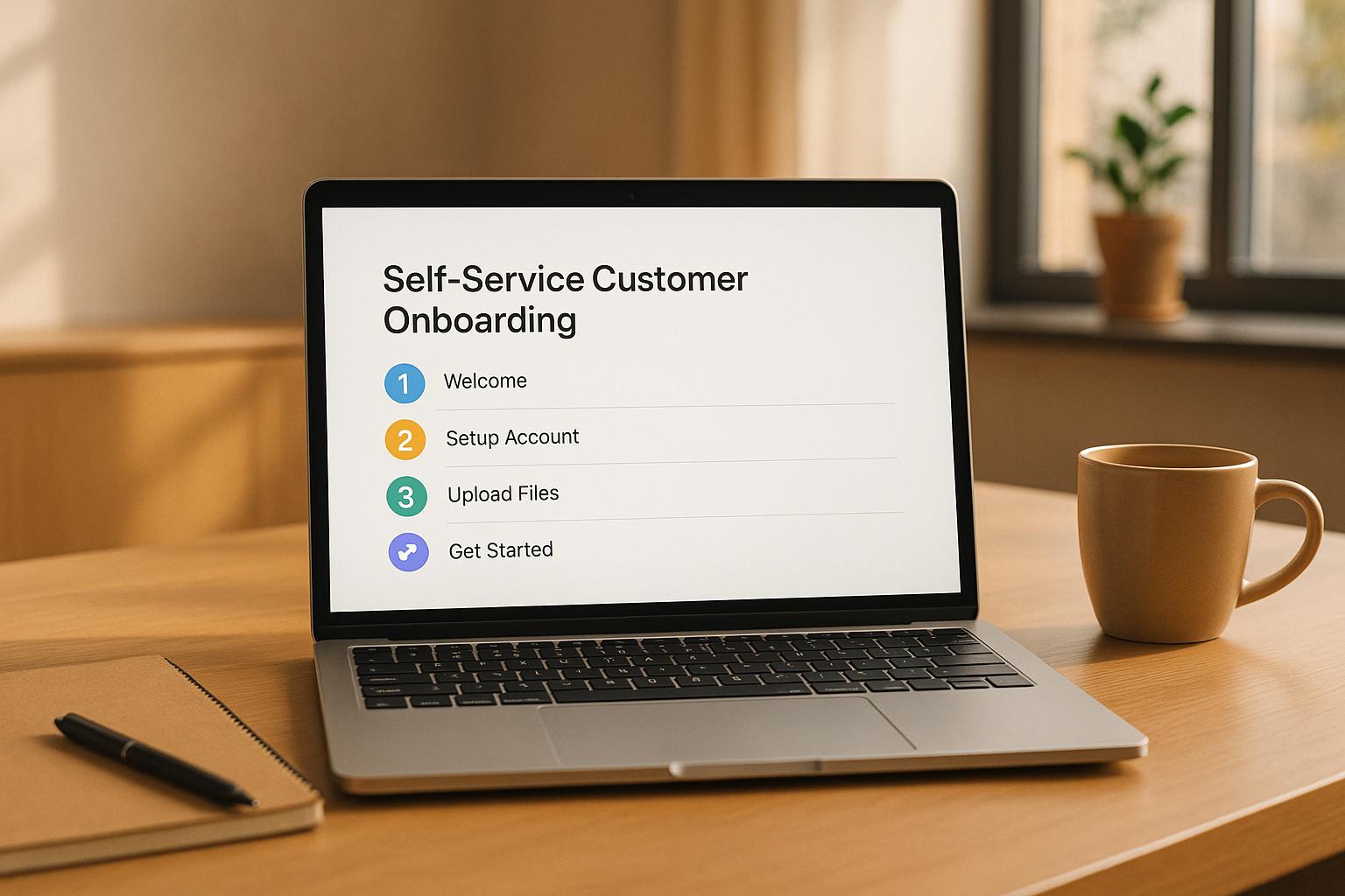
- Sequential Structures: Perfect for guiding users through a step-by-step process, such as onboarding flows or checkout systems. This approach minimizes distractions and keeps users focused.
- Matrix (or Faceted) Structures: These allow users to filter content by multiple criteria, like price, size, or color. This approach is especially helpful for giving users more control over their navigation.
For primary navigation, aim for 5–7 main categories. Too many can overwhelm users, while too few can make categories overly broad, leading to confusion.
What Is Information Architecture? (UX Design Guide)
How to Design Information Architecture: A Step-by-Step Guide
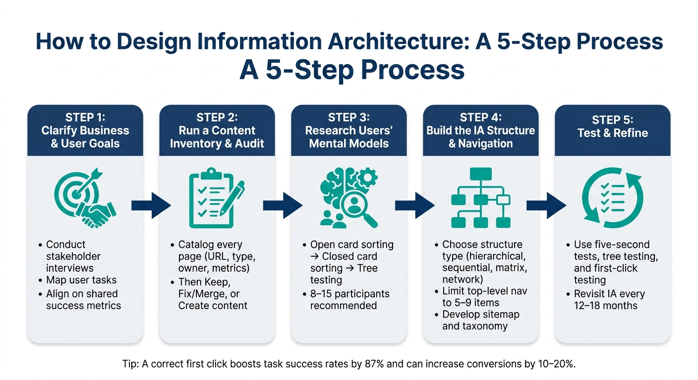
How to Design Information Architecture: A 5-Step Process
Creating effective information architecture (IA) involves a systematic approach that moves from initial discovery to thorough testing. Follow this step-by-step guide to apply the right principles and frameworks.
Step 1: Clarify Business and User Goals
Start by defining what success looks like for both the business and its users. Conduct interviews with stakeholders to understand their priorities and map out the primary tasks users need to accomplish. This shared understanding will act as the foundation for your IA decisions. Once goals are clear, move on to mapping your existing content.
Step 2: Run a Content Inventory and Audit
Take stock of your current content by cataloging every page along with key details like the URL, content type, owner, and engagement metrics. Once you have a complete inventory, evaluate each piece. Use a simple framework:
- Keep and enhance strong content.
- Fix or merge redundant or outdated material.
- Create new content to address any gaps.
This audit ensures your IA is built on a solid, well-organized foundation. With your content reviewed, the next step is to understand how users naturally think about and group information.
Step 3: Research Users' Mental Models
User research is critical in shaping your IA. Start with open card sorting to uncover how users naturally group information. Follow up with closed card sorting and tree testing to validate your structure and ensure users can easily find what they need. Aim to include 8–15 participants in these sessions to identify consistent patterns.
"Tree testing helps you gather insight into people's mental models of a product and how they would naturally think about exploring it." - Melanie Buset, Senior UX Researcher, Shopify
Additionally, review internal search logs to understand the language users expect. For example, if users frequently search for "invoices" but your navigation uses "billing documents", this mismatch can cause confusion and should be addressed.
Step 4: Build the IA Structure and Navigation
Using insights from your research, decide on an organizational structure that suits your content and user behavior. This could be hierarchical, sequential, matrix, or network-based. Develop a sitemap to outline parent-child relationships and define your taxonomy, including categories, tags, and attributes.
To keep it user-friendly, limit top-level navigation to 5–9 items, reducing cognitive load. Focus on making content easy to find rather than overly polished. For instance, providing multiple paths to the same information is better than a minimalist design that leaves users guessing. Use labels your audience understands - terms like "Products" or "Pricing" are often more intuitive than internal jargon.
Step 5: Test and Refine the IA
With your structure in place, it’s time to test and refine. Start testing early in the process to catch issues before moving to high-fidelity prototypes. Use methods like the five-second test to see if users can quickly grasp a page’s purpose and next steps. During tree testing, pay attention to whether users find their target directly or have to backtrack - backtracking often indicates unclear labeling. First-click testing is especially valuable for critical navigation paths, as a correct first click strongly predicts user success.
After launching your IA, monitor key performance metrics and revisit the structure every 12–18 months to ensure it continues to meet user needs effectively.
sbb-itb-97f6a47
IA Patterns and Best Practices for Digital Products
Common IA Patterns for Digital Products
Once you've fine-tuned your IA structure, the next step is to choose a pattern that fits your product's specific needs. These patterns act as a blueprint for designing effective navigation and enhancing the user experience.
The hierarchical (tree) structure works well for organizing content from general categories to detailed pages. It's particularly helpful for corporate websites or admin dashboards where users typically have a clear goal in mind. Sequential structures, on the other hand, are ideal for processes like onboarding or checkouts, where guiding users step-by-step minimizes decision fatigue. For platforms with extensive catalogs - like e-commerce sites or large resource libraries - a faceted structure allows users to filter content by multiple attributes (e.g., industry, role, or product type), offering greater control over their search.
| IA Pattern | Best Use Case | UX Benefit |
|---|---|---|
| Hierarchical | Corporate sites, dashboards | Simplifies navigation; clear parent-child links |
| Sequential | Onboarding, checkouts | Reduces decision-making friction |
| Faceted | E-commerce, resource hubs | Precise filtering for large datasets |
| Network | Wikis, knowledge bases | Encourages discovery and lateral exploration |
| Audience-Based | B2B portals | Tailors the experience to different stakeholders |
Poor navigation can severely impact business performance. Research indicates that 60% of online shoppers have abandoned purchases due to poor UX, with 37% citing confusing navigation or layout as a major issue.
Mobile-First IA Considerations
After testing your IA thoroughly, adapting it for mobile users becomes critical. Mobile experiences require a tailored approach due to smaller screens and shorter attention spans.
"Mobile navigation cannot replicate desktop navigation. The screen is smaller. The user's attention is more fragmented. The rules change." - Peter Makeshoff, Founder, Designer Daily
To optimize for mobile, limit primary navigation to 4–6 items and avoid nesting content beyond three levels. Deeply buried options in hamburger menus can frustrate users - mobile abandonment rates jump to 61% when users need more than two taps to access key content. Instead, consider a bottom navigation bar with 3–5 key destinations that are easy to reach with one hand. High-priority actions like "Contact Sales" or "Get Demo" should remain visible, even when other menu options are collapsed.
Another effective strategy is progressive disclosure: show subcategories only after a user selects a parent category. This keeps the interface uncluttered and focused. On mobile, search often becomes the go-to navigation method, so investing in a strong search experience can act as a safety net when users struggle with browsing.
By combining these mobile strategies with clear labeling and an intuitive search system, you can create an experience that keeps users engaged.
Connecting Navigation, Search, and Labeling Systems
For a cohesive IA, navigation, search, and labeling must work seamlessly together. Any inconsistency between these elements can disrupt the user journey. One common issue is mismatched terminology: if navigation labels like "Solutions" don't align with user search terms like "Products", users may struggle to find what they need. To address this, audit your site-search logs every 90 days. Reviewing the top 50 search terms is often enough to identify misalignments. If terms don’t match your navigation labels, update your taxonomy to reflect how users think.
"Labels set expectations; 'Solutions' in your navigation commits users to specific content." - Henry Adepegba, Freelance Writer
Consistency is key. Use the same labels across navigation menus, search results, and page headings. Even small discrepancies - like "Help Center" in the menu but "Support Documentation" on the page - can confuse users and erode trust. For large websites, scoped search (allowing users to narrow results to specific sections like "Documentation" or "Resources") can reduce irrelevant results and improve efficiency. Additionally, contextual cross-links - such as linking a product page to a related case study - encourage natural navigation without relying solely on the main menu.
Aligning Information Architecture with Business Goals
How IA Supports Business Outcomes
Strong information architecture (IA) directly impacts revenue and efficiency. As Henry Adepegba puts it:
"Information architecture is not just a design specialty. It is a strategic decision about how your business represents itself to the people who pay for your service."
The numbers back this up. Around 50% of potential sales are lost because users struggle to find what they need. On the flip side, large e-commerce sites have achieved 35% higher conversion rates by refining navigation and checkout processes. A well-organized IA simplifies the journey from intent to action - every extra click or unclear label risks losing a customer.
This isn't just about customers. In enterprise environments, employees spend about 25% of their workday searching for information due to poorly designed systems. That’s a significant productivity drain, affecting internal teams as much as external users. To tackle these challenges, many businesses turn to professional consultants for guidance.
The Role of Consulting in IA Projects
When multiple teams manage different parts of a website, priorities can clash, leading to a structure that reflects internal hierarchies rather than user needs. This misalignment can quietly sabotage conversions. Consulting experts bring an external perspective and proven methods, like tree testing and card sorting, to validate IA decisions with real users. They also help organizations set up governance frameworks, ensuring the IA remains effective as new content or features are added.
Interestingly, IA-specific research, taxonomy development, and testing only account for 3% to 5% of a digital project’s total cost. That’s a small investment compared to the expense of fixing a flawed structure post-launch.
Finding Expert Consulting Support
For businesses navigating complex IA challenges, finding the right consultant is key. The Top Consulting Firms Directory is a valuable resource, connecting companies with specialists in digital transformation, UX strategy, and IT - precisely the expertise needed to align IA with broader business goals.
Conclusion
Information architecture (IA) forms the backbone of digital products. When done right, it helps users effortlessly locate information, complete tasks, and contributes to measurable business success. On the flip side, even the most visually stunning website can frustrate users and lead to abandonment if its structure is poorly planned.
As one expert puts it:
"Information architecture might be the invisible force behind great User Experience (UX), but its impact is undeniably visible in user behavior and business results."
To make IA intuitive, it’s essential to organize content in ways that align with users’ mental models. This means using their vocabulary, keeping navigation straightforward, and validating the structure through user testing. Regular reviews ensure the system remains user-friendly over time.
Henry Adepegba captures this perfectly:
"IA is the bridge between your offering and your customer's vocabulary. When the bridge is well built, customers quickly find what they need and convert."
Research shows that a correct first click boosts task success rates by 87% and can lead to a 10–20% increase in conversions. These numbers highlight how IA directly impacts both the user experience and business performance.
FAQs
What’s the difference between information architecture and navigation?
Information architecture serves as the blueprint for a website, focusing on how content is organized and structured to ensure it's logical and easy to locate. Think of it as the behind-the-scenes framework that dictates how everything is connected.
Navigation, on the other hand, is what users actually see and interact with. This includes elements like menus, breadcrumbs, and links - the tools that guide users through the site. While navigation brings the structure to life, information architecture lays the foundation that makes it all work seamlessly.
How do I know if my IA is hurting conversions or usability?
Struggling with conversions or usability? Your Information Architecture (IA) might be the culprit. Here are some warning signs to watch out for:
- Users frequently moving backward or sideways while navigating - this often means they’re lost or unsure where to go.
- High bounce rates, which can indicate frustration or an inability to find what they’re looking for.
- Feedback from users saying they’re having trouble locating content.
To pinpoint issues, dive into your analytics. Look for patterns like drop-off points or areas with low task-completion rates. Additionally, tools like usability tests, tree testing, and card sorting can help uncover where your IA might not align with what users expect. These insights can guide you toward a more intuitive structure.
Which IA structure should I use for my product (hierarchical, sequential, or faceted)?
The most effective information architecture aligns with your product's goals and how users engage with your content:
- Hierarchical: Works well for content-rich platforms like documentation or catalogs, guiding users from broad categories to more specific topics.
- Sequential: Suited for processes with defined steps, such as completing a checkout or following a tutorial.
- Faceted: Ideal for large inventories, such as e-commerce sites, allowing users to dynamically filter results using metadata.