Most productivity benchmarks fail because the peer group is wrong. If you run a $50 million to $300 million business, the useful view is not a broad market average. It is a matched peer set by industry, business model, geography, labor mix, and maturity.
I would boil this article down to 4 points:
- Use 4 metrics together: output per employee, revenue per FTE, utilization, and labor cost ratio
- Do not compare unlike models: a SaaS firm, hospital, plant, and 3PL do not convert labor into output the same way
- Watch the constraint that matters most by sector: automation, seasonality, payer mix, bench time, or dispatch gaps
- Turn gaps into levers: staffing, scheduling, pricing, workflow, assignment speed, and capacity planning
The article covers 6 industries:
- Manufacturing
- Retail and e-commerce
- Healthcare providers
- Technology and software
- Professional services and consulting
- Transportation and logistics
A few numbers frame the issue fast. In services, a healthy utilization band is often 74% to 84%, but consulting utilization fell to 66.4% in 2025. In healthcare, pushing clinician utilization above 85% can hurt retention and care quality. In logistics, firms with stronger automation and visibility can post utilization rates up to 36.4 points higher than weaker peers. In manufacturing and retail, $175,000 to $250,000+ revenue per FTE can be a starting point - but only inside a tight peer set.
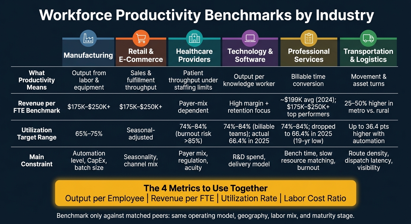
Workforce Productivity Benchmarks by Industry: Key Metrics at a Glance
Quick Comparison
| Industry | What productivity mostly means | Main KPI to watch | Main constraint |
|---|---|---|---|
| Manufacturing | Output from labor and equipment | Output per employee, utilization | Automation level, batch size, CapEx |
| Retail & e-commerce | Sales and fulfillment throughput | Revenue per FTE | Seasonality, channel mix |
| Healthcare providers | Patient throughput under staffing limits | Adjusted patient days or visits per FTE | Payer mix, regulation, acuity |
| Technology & software | Output per knowledge worker | Revenue per FTE plus margins and retention | R&D spend, delivery model |
| Professional services & consulting | Billable time conversion | Utilization | Bench time, burnout, role mix |
| Transportation & logistics | Movement and asset turns | Throughput per FTE, utilization | Route density, visibility, scheduling |
Bottom line: I would use this piece to set board-level productivity targets only after I split peers the right way and link each gap to a P&L lever. That is the only way a benchmark becomes useful instead of noise.
sbb-itb-97f6a47
1. Manufacturing
Benchmark manufacturing against the right peer set or the numbers will mislead you. A high-volume automated plant and a small-batch custom fabricator can sit in the same broad sector and still run on very different economics. That gap shows up in output, revenue, utilization, and labor cost.
Output per Employee
Output per employee means little without context. Automation can push output up without adding headcount, so output is now less tied to labor than it used to be. Compare peers by product mix, batch size, and automation level. If those factors are off, the benchmark is off too.
Revenue per FTE
Revenue per FTE is useful, but only inside a matched production model. A common range is $175,000 to $250,000+ per FTE, but that only holds when the comparison group shares the same operating setup. Keep make-to-stock and make-to-order plants in separate groups.
Revenue points to pricing power. Utilization shows whether the plant is getting enough out of its asset base.
Utilization
Utilization in manufacturing is a labor-and-equipment measure, not just a staffing metric. You need to look at both labor uptime and equipment uptime. Use 65% to 75% as a starting range, then adjust for maintenance and changeovers [3].
Labor Cost Ratio
Labor cost ratio should be read alongside capital intensity. Plants using AI can push labor share down while pushing CapEx up [1].
Retail and e-commerce shift the benchmark away from equipment uptime and toward order volume, conversion, and fulfillment speed.
2. Retail and E-commerce
Benchmark retail and e-commerce productivity by operating model, not as one blended category. Store labor, fulfillment, and customer service run on different economics, so you need 3 separate views: store, warehouse, and digital.
Output per Employee
Compare peers by service model first - store-led, omnichannel, or pure-play e-commerce. Output per employee can move a lot based on fulfillment mix, even when top-line revenue looks similar.
Revenue per FTE
Revenue per FTE is a useful productivity proxy in retail because it reflects both individual output and how well technology is scaling the business [3]. Use $175,000 to $250,000+ per FTE only as a starting range for scaled, service-heavy retail peers. In retail, this metric carries the most weight where digital scale is highest.
Utilization
Measure utilization as productive hours divided by available hours. Adjust for seasonality so temporary demand swings do not get mistaken for structural inefficiency.
Labor Cost Ratio
Omnichannel scale often lowers labor share while increasing technology and fulfillment investment.
Healthcare changes the benchmark again because staffing, regulation, and patient flow constrain output in a different way.
3. Healthcare Providers
Healthcare productivity is only useful when you compare like with like. Care setting, payer mix, and patient acuity change the numbers fast. If the peer set is loose, the benchmark is weak. Staffing limits, regulation, and patient flow also cap how far labor productivity can move. That makes volume, revenue, utilization, and labor cost tougher to judge unless the comparison group is tight.
Output per Employee
In acute care, adjusted patient days per FTE is a common output measure. In other settings, the better unit may be visits or procedures per employee, based on the care model.
Revenue per FTE
Revenue per FTE is heavily shaped by payer mix. Two providers can show similar clinical throughput and still post very different revenue per FTE. That is why cross-system comparisons work best when the peer group is closely matched on payer mix.
Utilization
Sustained clinician utilization above 85% raises burnout risk and can erode care quality [4]. A practical target range is 74% to 84%.
Labor Cost Ratio
Use labor cost as a share of net patient service revenue only when comparing providers with similar care models and patient populations.
Technology and software follow a different productivity model, where output is tied more to knowledge work than patient flow.
4. Technology and Software
Benchmark software businesses by output per knowledge worker, not just headcount. That matters even more when you compare a pure SaaS company with a hybrid software-services firm. The economics are different, so the peer set should be different too.
Output per Employee
The focus has moved from cutting labor cost to getting more output from each worker. In 2025, high-AI-exposure industries added 1.7 percentage points to U.S. productivity growth, up from 0.7 percentage points the prior year [1]. That sets the backdrop. For operators, the sharper question is simpler: how much output does each knowledge worker produce versus peers with the same product mix and delivery model?
Revenue per FTE
Revenue per FTE works as a scale metric for SaaS only when you read it with margin and retention. On its own, it can mislead. If revenue per FTE is going up while net revenue retention is slipping or margins are tightening, that points to a scaling issue, not better productivity.
Utilization Model
For hybrid software firms with billable delivery teams, utilization is still a core operating measure. A practical range is 74% to 84% [4]. Recent market data moved the other way, with billable utilization at 68.9% in 2024 and 66.4% in 2025 [4] [6].
One driver stands out: time from availability to assignment - the lag between when a team member becomes available and when that person is proposed to a client [4]. It sounds small, but it hits revenue fast. Firms using Professional Services Automation (PSA) tools report 10% higher billable utilization on average than firms still running on spreadsheets, and a practical target is to keep that lag below 48 hours [4].
Labor Cost Ratio
A lower labor-cost-to-revenue ratio does not always mean the model improved. In tech, it can mean output per worker increased, or it can mean spend moved away from payroll and into compute and data infrastructure [1]. That is why labor cost ratios need to be read against the capital budget, not in isolation.
In hybrid firms, the next step is straightforward. If labor is moving into delivery work, utilization becomes the next metric to track. That split matters most because product scale and billable delivery do not follow the same rules.
5. Professional Services and Consulting
In professional services, productivity rises or falls on billable time. Unlike software, consulting does not have product scale to cover weak utilization. There is no inventory, no patient flow, and no unit count - just time billed against time available.
Output per Employee
Output per employee is less uniform in consulting than it is in manufacturing or retail. The usual proxy is revenue per consultant, which averaged about $199,000 in 2024, down 5% from the prior year [4]. That drop tracks with softer utilization.
Role mix also changes the picture. Junior consultants usually carry billable targets in the 78% to 88% range, while senior managers and partners tend to run closer to 55% to 70% because more of their time goes to business development and client relationships [4]. If you compare peer firms without adjusting for seniority mix, the numbers can point you in the wrong direction.
Revenue per FTE
Revenue per FTE only becomes useful when firms are split by tier and service mix. In practice, that makes utilization the main driver of both revenue per FTE and labor cost ratio.
In partner-led consulting firms, high-performing practices aim for revenue per employee of $175,000 to $250,000+ [3]. Some firms push farther into value-based advisory pricing, which breaks the link between revenue and labor hours. In those cases, reported effective hourly rates run $400 to $800+ for strategic work, versus $200 to $350 for standard compliance engagements [3].
Utilization Model
Billable utilization is still the metric most operators watch in professional services, and it is under strain. In 2025, it dropped to 66.4%, the lowest level in 19 years [6]. A healthy operating range sits at about 74% to 84%, with higher targets for junior staff and lower ones for senior managers and partners [4].
Push utilization above 84%, and burnout and quality risk start to climb [4]. Let it fall below 70%, and bench cost stays fixed while billable output contracts, which puts more pressure on margin [5].
One staffing issue often gets missed: the hidden bench. These are consultants who are available but not visible to project managers because internal tracking lags. Top-performing firms aim for under 48 hours from the point a consultant becomes available to the point they are proposed to a client [4].
Labor Cost Ratio
Lower billable utilization pushes labor cost pressure straight into the P&L. Across the industry, EBITDA fell from 15.4% in 2023 to 9.8% in 2024 as a result [4] [5].
High-performing firms put 10% to 15% of revenue into technology and training to offset that pressure [3]. The math is straightforward: each 1-point gain in utilization adds about $2,500 to $4,000 per consultant per year [4].
The next step is choosing the right peer group before turning these numbers into targets.
6. Transportation and Logistics
In transportation and logistics, the benchmark is not knowledge work. It is movement, dispatch, and asset turns. Whether you are looking at a trucking fleet, a fulfillment warehouse, or a third-party logistics provider, the core issue is simple: how well the business keeps people and assets productively in motion.
Output per Employee
Physical throughput per worker is the main output metric in this sector - shipments moved, orders picked, or loads dispatched per FTE. Start peer comparisons with the operating model, not headcount. Fleet type, warehouse format, and 3PL versus asset-based carrier have more impact on throughput than staffing levels by themselves.
That shifts the next test to speed and density, not headcount alone. A warehouse built for high-volume pick paths will not behave like a low-density distribution site. The same goes for a regional carrier versus a long-haul fleet.
Revenue per FTE
Revenue per FTE shows how well the operating model turns labor and assets into revenue. Geography has an outsized effect on this metric. Firms in major metro markets often post 25% to 50% higher revenue per employee than rural peers, and those gaps usually line up with higher local labor cost ratios [3].
Use market density and cost of living as peer-group filters, not just the industry label. If you skip that step, the comparison can point you in the wrong direction.
Utilization Model
In transportation and logistics, utilization is measured as active moving, picking, or dispatching time divided by paid hours. Firms with mature use of real-time visibility and automation can reach utilization rates up to 36.4 percentage points higher than low-maturity peers [5].
A related KPI is dispatch latency - the time from when a resource becomes available to when it is assigned to the next load or order. Top operators track it because it exposes scheduling gaps early and cuts bench time that weakens labor cost ratios [5]. Those deployment gaps flow straight into the labor line.
Labor Cost Ratio
Labor cost ratios can split apart even when revenue per FTE looks similar. One common reason is idle scheduled labor. Staff may be on the clock and available, but if they are not visible to the scheduling system, payroll turns into unrecovered cost [5].
Firms using automation tools report 10% higher utilization and 28% higher EBITDA than peers still relying on manual scheduling [5].
Labor share only means something when you compare businesses with similar route density, facility mix, and automation maturity. In this sector, labor deployment, visibility, and automation often matter just as much as demand when operators compare productivity across peers.
Peer Benchmarking, Target Setting, and Key Trade-Offs
How companies build the right peer group
The peer group has to match the operating model, or the benchmark will mislead you. Output per employee, revenue per FTE, utilization, and labor cost ratio only mean something when the comparison set lines up on business model, labor model, scale, and stage of maturity.
Start with 6-digit NAICS codes. Census Bureau and Bureau of Labor Statistics data is organized at that level, so you can isolate peers by specific activity instead of broad sector [2]. Then narrow the set by business model, labor model, company size, geography, and maturity.
Geography should be treated as an adjustment factor, not a pure read on performance. Productivity benchmarks can run 25%–50% higher in major metro markets than in rural areas because market density and cost structure are different [3].
Federal data also comes with lag. Census County Business Patterns is usually about 2 years behind, and BLS quarterly data is typically 6 to 9 months old [2]. That makes those sources useful for structural baselines, not for fast-moving operating reads. For items like utilization, pair federal data with current industry surveys.
Once the peer set is in place, the gap gives you the starting point for the target.
How to turn benchmark gaps into targets
A benchmark gap only matters if you can tie it to an operating lever. The move from current performance to top quartile should not end as a board slide. It has to convert into staffing, scheduling, pricing, workflow, or capacity actions.
Professional services is the clearest case. Billable utilization fell to 68.9% in 2024, the lowest level in 5 years, while the healthy operating range sits between 74% and 84% [4]. Every 1-point gain in utilization is worth about $2,500–$4,000 per consultant per year [4]. That gives management a direct bridge from benchmark to EBITDA impact.
In services businesses, leading indicators matter as much as lagging ones. Revenue per FTE tells you the result. Time to assignment and bench coverage tell you why the result happened [4]. Firms using Professional Services Automation tools report 10% higher billable utilization on average than firms still relying on manual processes [4]. In practice, the gain often comes from better scheduling visibility and faster resource matching, not from pushing teams harder.
Main trade-offs by industry
Each industry has a different constraint, so target setting has to reflect that reality. A top-quartile number without context can drive the wrong behavior.
| Industry | Primary Trade-off | Key Constraint | Model Strength | Model Constraint |
|---|---|---|---|---|
| Manufacturing | Output volume vs. automation investment | Capital intensity and batch size limit direct peer comparison | High scalability with automation | CapEx requirements can be prohibitive for smaller operators |
| Retail & E-commerce | Volume vs. seasonality | Extreme Q4 demand spikes can distort annual benchmarks | High-volume model | Seasonal swings make annual comparisons noisy |
| Healthcare Providers | Throughput vs. compliance | Regulatory requirements and staffing constraints limit flexibility | Stable, need-driven demand | Labor intensity and compliance costs limit margin expansion |
| Technology & Software | Profit per employee vs. acquisition cost | Heavy upfront R&D and customer acquisition spending | High profit per employee potential | Extreme upfront R&D and customer acquisition costs |
| Professional Services | Utilization vs. burnout | Above 85% utilization, retention and delivery quality tend to deteriorate [4] | Talent leverage and pricing power | Bench time and slow resource matching weaken productivity [4] |
| Transportation & Logistics | Asset leverage vs. macro exposure | Macro cycles and interest rates can compress returns quickly | Strong asset leverage in dense markets | Vulnerable to macroeconomic cycles and interest rates |
When outside advisers are useful
Outside advisers are most useful when the gap is clear but the operating fix is not. That usually shows up when utilization falls below the healthy range, when a hidden bench is building because resource matching is too slow, or when the labor model needs a reset for AI integration [4].
In those cases, an operations or labor-model specialist is usually the right fit. For PE-backed and mid-market companies, the Top Consulting Firms Directory is a practical place to screen for operating partners and sector specialists. DevriX is also worth a look when the issue sits at the intersection of digital operations, workflow design, and revenue execution.
Conclusion
Key takeaways from the comparison
There is no single productivity metric that works across industries. Benchmark only against real peers with the same operating model, geography, and customer mix.
The pattern stays the same in every sector: the gap shows up only when the peer group is matched the right way. In professional services, top-performing organizations deliver more than double the revenue growth of lagging peers and much higher profitability [6]. The same logic applies in manufacturing, retail, healthcare, technology, and logistics - the benchmark means little if the comparison group is loose.
That is why one metric on its own falls short. Output per employee, revenue per FTE, utilization, and labor cost ratio each show a different part of the picture. Used together, they give operators a clearer read on labor efficiency, delivery model, and margin pressure.
Use a balanced set of benchmarks
Once the peer set is right, these 4 metrics become useful for action. Standardize the inputs first, then compare like-for-like peers. Use consistent U.S. definitions for FTEs, labor costs, and utilization. Normalize available hours to 1,760 per year. That is what turns a benchmark from a board slide into something the business can use.
FAQs
How do I choose the right peer group?
Pick peers from your own industry sector. Spending patterns and operating models usually differ more by sector than by company size.
Don’t lean on broad averages by themselves. Benchmark metrics like revenue per employee and IT spend as a percentage of revenue against similar companies, then focus on the 25th to 75th percentile range. That gives you a more useful view of where you sit and helps avoid bad calls based on averages that hide too much.
Which productivity metric should I prioritize first?
Prioritize revenue per employee - or revenue per FTE - first. It ties workforce productivity straight to business results, which is why it works well as a cross-industry benchmark.
You can compare it cleanly against peer organizations and use it alongside measures like output per hour and utilization.
How often should I update productivity benchmarks?
Update productivity benchmarks on a set cadence tied to your data refresh - in most cases, annually. For example, SPI’s professional-services benchmark updates year over year based on the prior year’s survey inputs.
For practical use, treat peer-group benchmarks as a live management input driven by data, not a one-time reference point. Recheck them more often when core metrics such as utilization or revenue per FTE start to move.